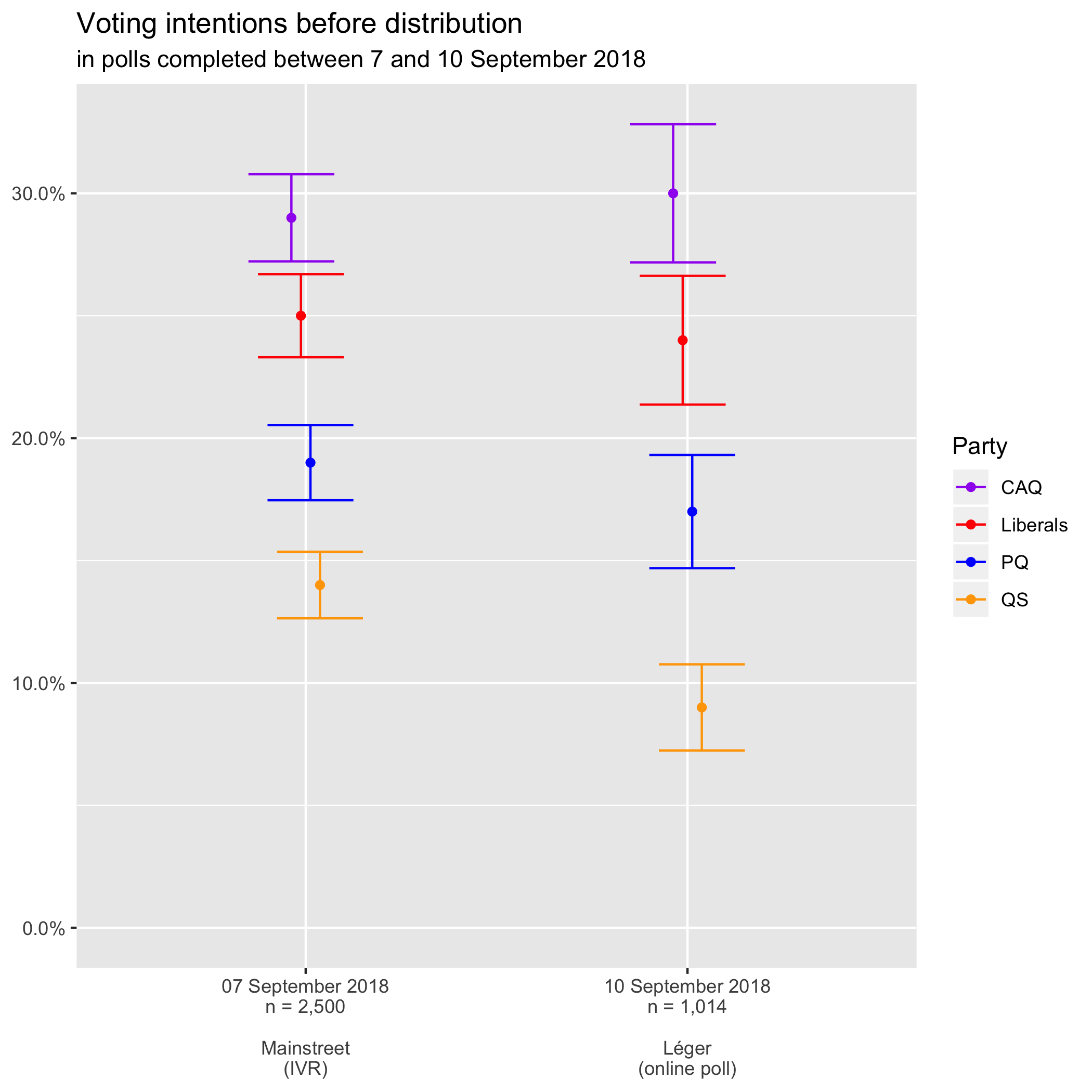
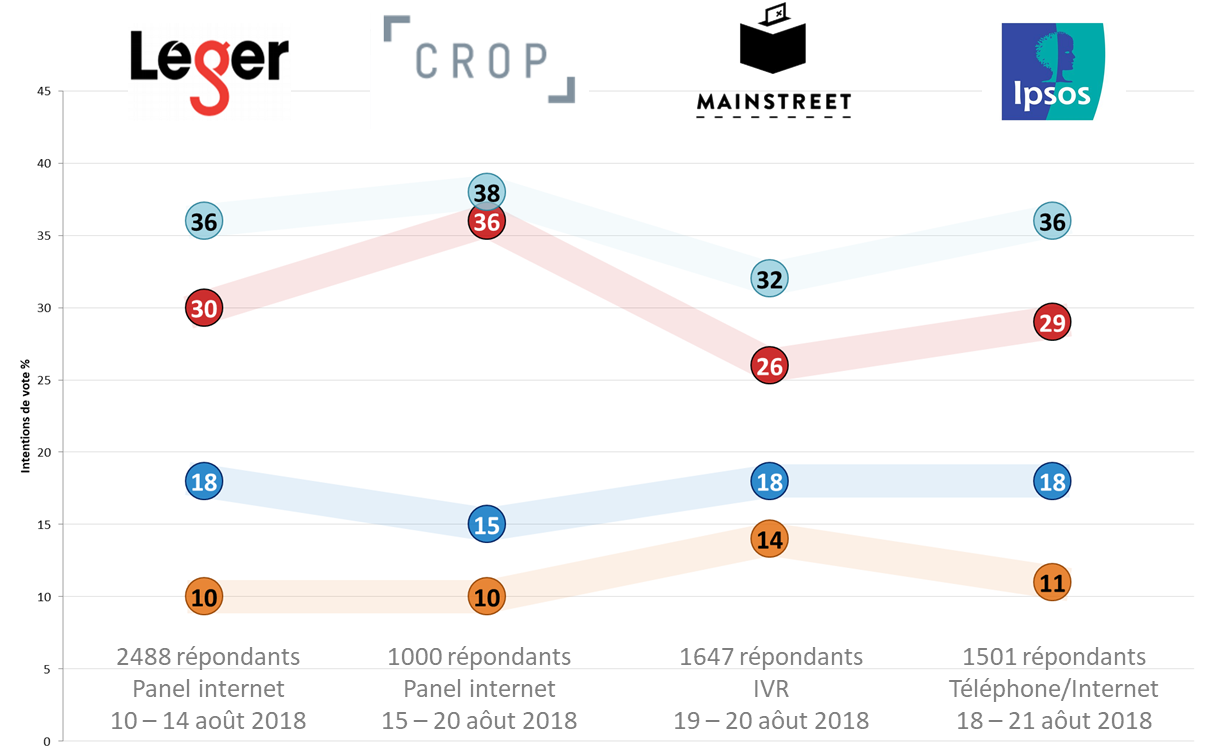
Joseph Angolano, Mainstreet vice-president, sent me the link to the full report, so I got to update my voting intention graphs (with error bars!) before the undecided are allocated.
I’ve only included the last Mainstreet and Léger polls because those of CROP, Ipsos, and Forum were conducted before the campaign had even officially started.
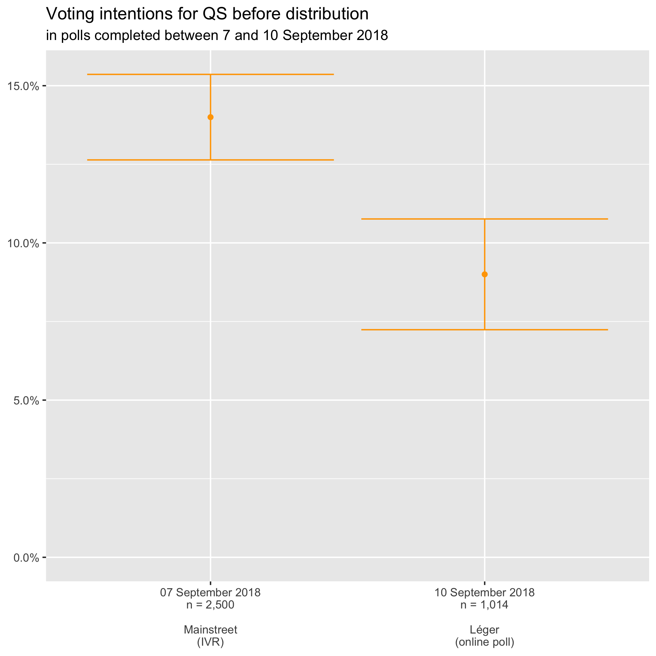
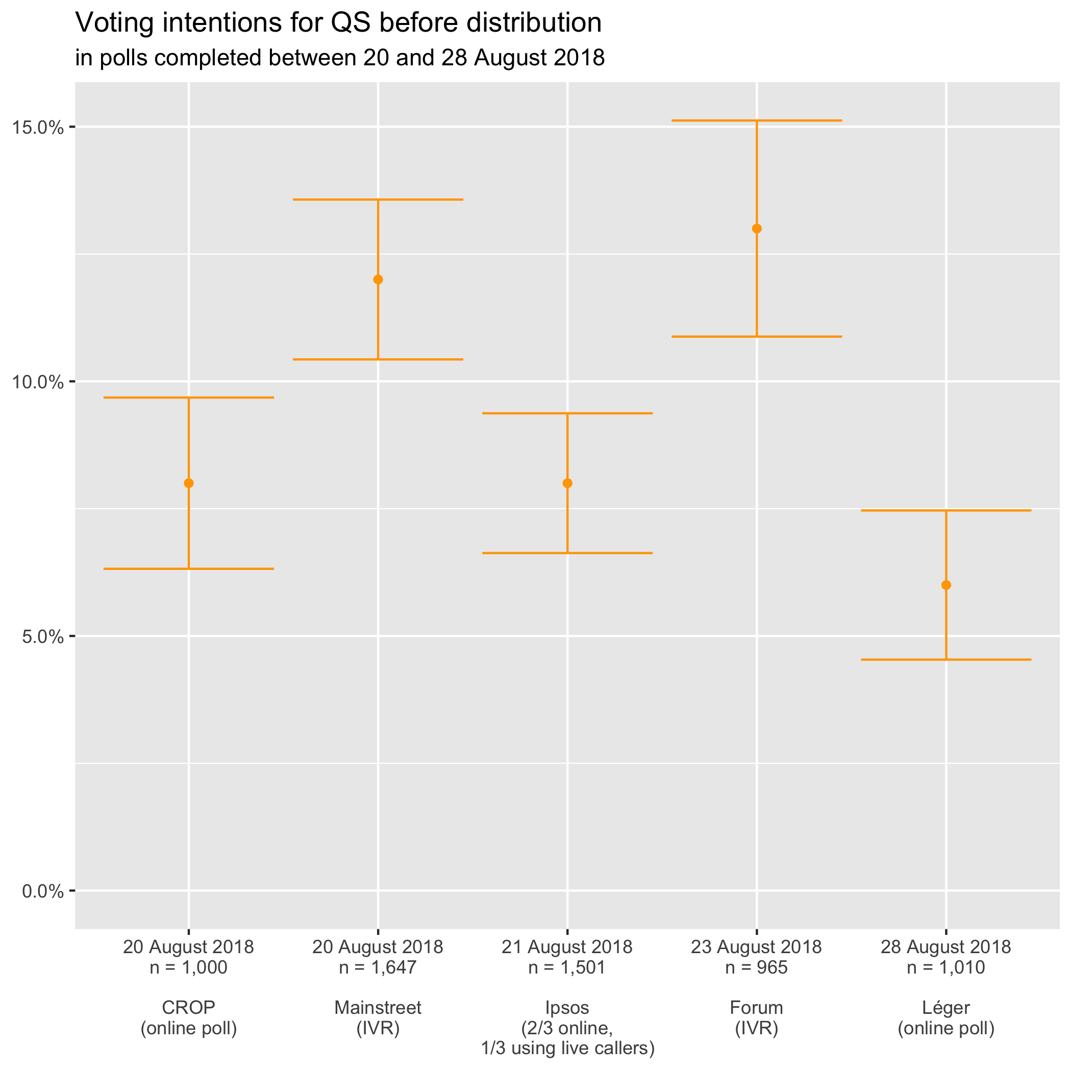
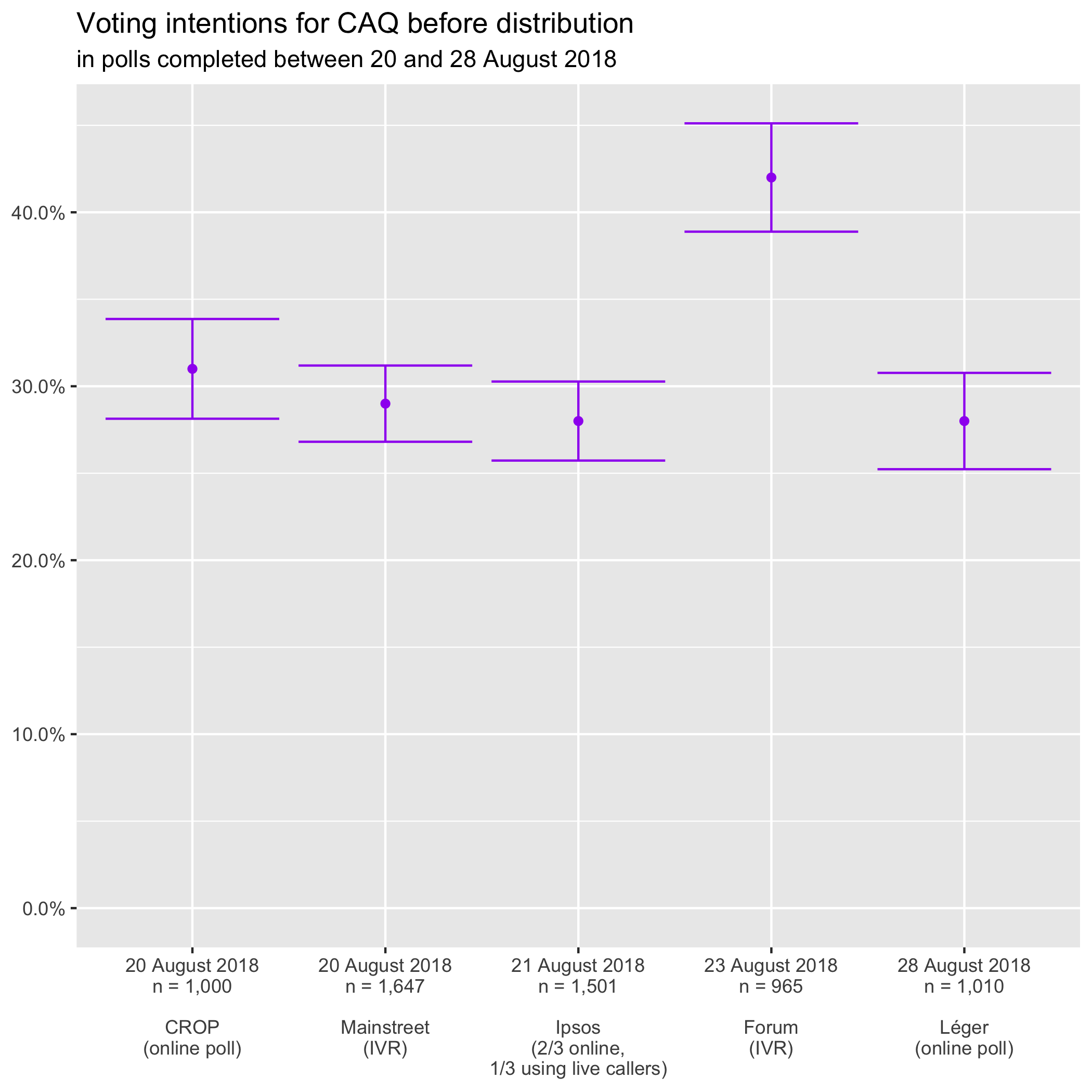
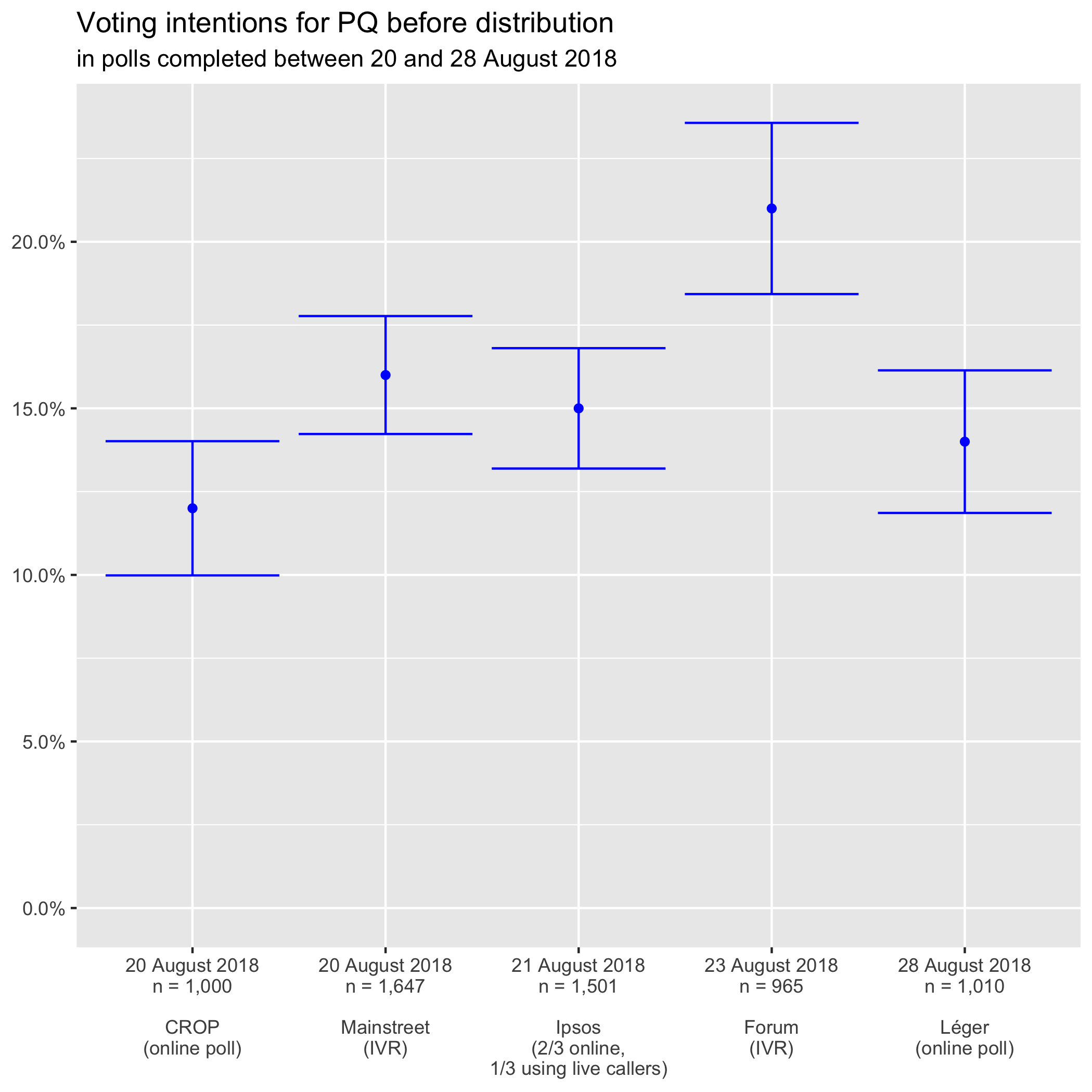
You can see that all results are compatible (the error bars overlap) except for Quebec Solidaire:
Indeed, none of the error bars touch the 12.5% line.
Last night, when the Léger results were announced, Too Close To Call’s Bryan Breguet pointed out that Léger and Mainstreet disagreed on voting intentions for the CAQ and for QS:
En gros Léger et Mainstreet s’entendent parfaitement sur le PLQ et le PQ, mais Léger a la CAQ 5 points plus élevé et QS 5 points plus bas. Intéressant que les différences soient entre CAQ et QS1.
He comes to that conclusion using scores after distribution. As we have seen, before distribution both polling firms agree that CAQ voting intentions lie somewhere between 27% and 31%.
In this morning’s blog post, Bryan expanded on the topic. He returned to the difference between Mainstreet’s local and province-wide polls, which he had mentioned in yesterday’s blog post:
Mainstreet et Léger en fait s’entendent parfaitement sur le PLQ et le PQ. Par contre ils ont des chiffres fort différents pour la CAQ et QS. Mainstreet a ces partis à respectivement 31% et 16% alors que Léger les a à 35% et 11%. Une différence de 4-5 points pour chaque parti. Qui dit vrai? Impossible d’y répondre pour sûr mais les sondages par comté de Mainstreet sont bien plus cohérents avec une Coalition à 35%-36% et QS à 11%. Ainsi je serais tenté de dire que Léger a possiblement raison ici. Mais il nous faudra attendre d’autres sondages (et en fait l’élection) pour en être sûr2.
If you can read French, I highly encourage you to read his blog post on the disagreement between Mainstreet’s province-wide and riding polls. To entice you to read the whole thing for yourselves, here’s the table he comments:
So let’s recap. On the one hand, province-wide Léger and Mainstreet polls disagree on QS support. On the other hand, the results of Mainstreet’s riding polls fit better with the picture painted by Léger (CAQ higher, QS lower).
Source data
You can access the spreadsheet from which the charts were generated on Google Spreadsheets.
My God, was it time or what?!? As Bryan Breguet put it on Twitter while awaiting the Léger results:
Juste une observation générale mais quand il y a davantage de personnes/sites faisant des projections que de firmes offrant des sondages, c’est pas vraiment normal1.
Thank goodness, this morning, Léger released the full report of its latest poll, conducted between 7 and 10 September!
I’m waiting to get my hands on the Mainstreet report for the poll conducted 5 to 7 September to update the voting intentions chart since I need the figures before allocating the undecided. At the moment, I only have the Le Soleilarticle, which only gives the results after distribution.
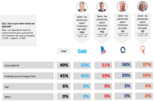
We can nevertheless update our voter volatility charts:
Voter volatility is fairly stable. The share of voters whose choice is definitive amongst those who have made a choice has gone from 56% to 58% in the span of a fortnight.
The results broken down by party are more revealing:
Voting intentions for the Parti Québécois seem to be going up, with a two-percentage-point increase over the last two weeks (19% to 21% once the undecided are allocated). However, the PQ has slipped from the party with the least wavering electorate to the second to last amongst the Big Four.
Indeed, in the poll that ran until 28 August, 64% of people who intended to vote for the PQ considered that their choice was definitive. In yesterday’s poll, that proportion was down to 54%. Jean-François Lisée’s party is the only to have seen its voters’ volatility increase!
Do these results mean that people who are moving back and forth between the PQ and the CAQ are now saying that they will vote PQ, but that they might still change their minds?
To figure that out, we’ll have to dig into answers to the question related to alternative choices… to be continued!
Source data
You can access the spreadsheet from which the charts were generated on Google Spreadsheets.
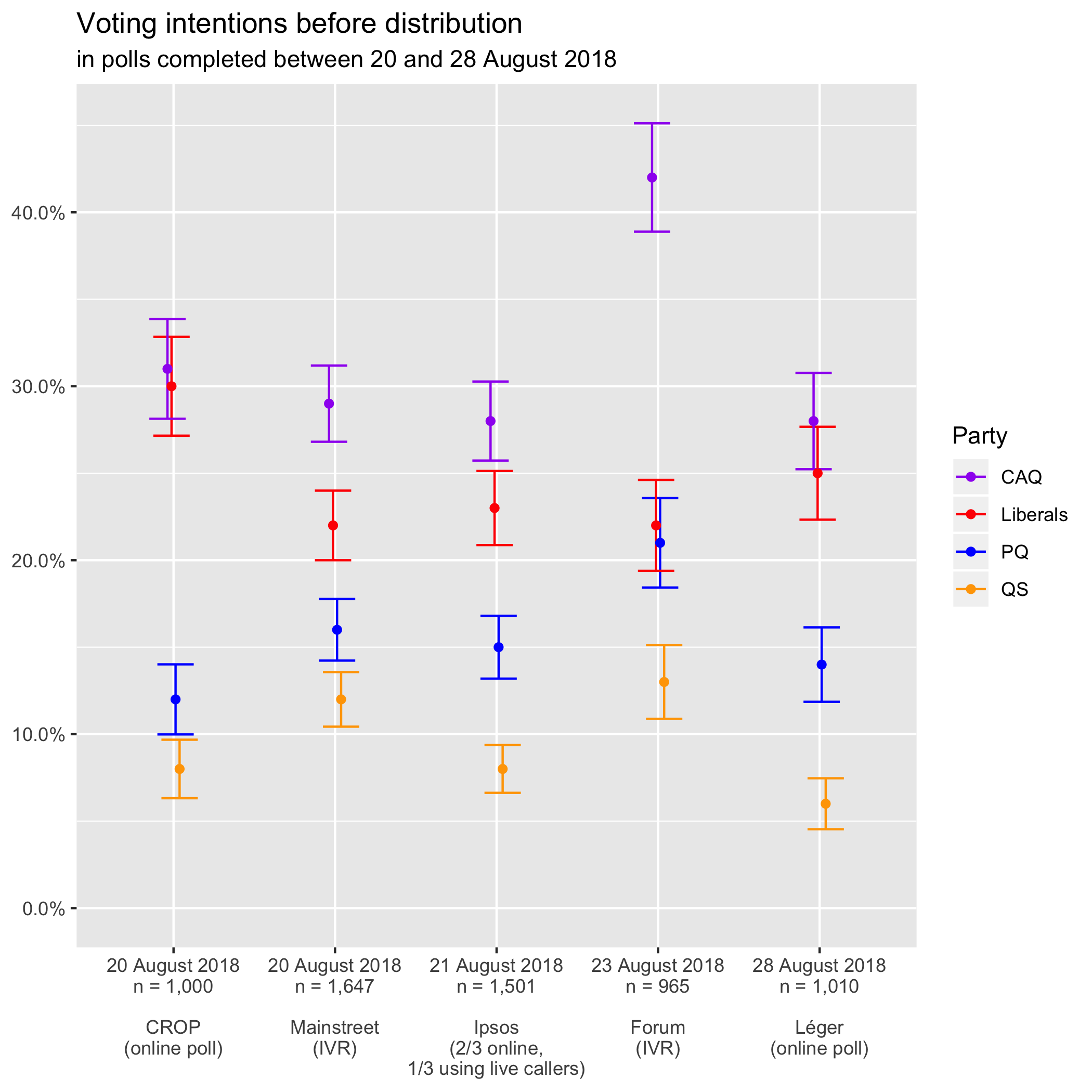
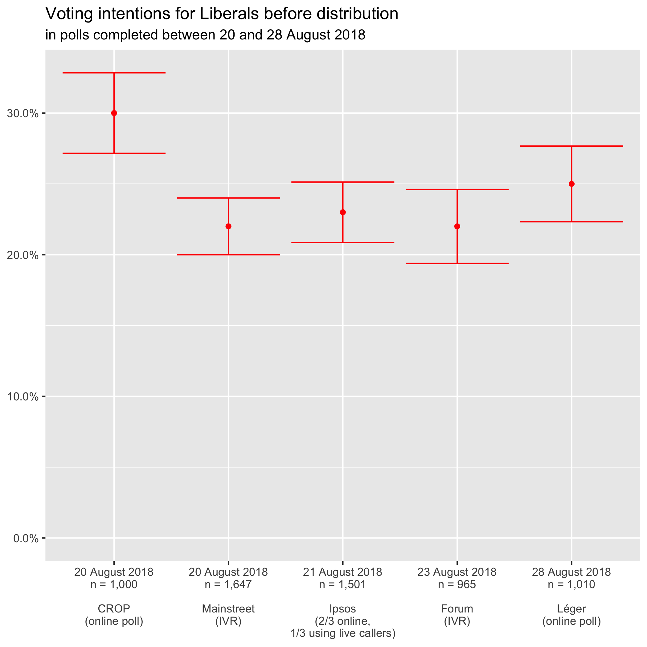
I left you hanging last Friday when I promised a new data visualization of the most recent polls. To refresh your memory, the margin of error depends on the score in the poll (it increases when the score gets closer to 50%) and the sample size (one goes up while the other goes down). It does not depend on the size of the population of which you want to know the opinion.
As promised
I did a graph similar to the one in Qc125 (with margins of error this time) for the last three polls in that Qc125 diagram. I added the Forum poll (conducted on 23 August with 965 respondents) and the last Léger (conducted from 24 to 28 August with 1010 respondents).1
I first tried to do it in Google Spreadsheets, so you could access the file and check everything out. However, I could only add an error bar that was either a constant or a percentage. As we saw on Friday, polling margins of error are a bit more complicated than that.
I also tried with Excel and its open-source equivalent LibreOffice but bumped into the same problem: there was no way of defining a different error bar for each point. It doesn’t come as much of a surprise, then, that there are so few representations of polling data with margins of error.
I had managed just fine by using candlestick charts (used to describe movements in the stock market), but Martin objected that they were ugly. Hence, to please the pole in our tandem in charge of graphics, I pulled out the big guns and programmed the graph in R, an open-source statistical analysis software.
After too many hours fiddling about, here’s what I got2:
Each point situates the party’s score in the poll. The vertical line contained within the two horizontal lines describes the confidence interval if you take into account the margin of error at 95% (or 19 times out of 20). You can see that the lines higher up are longer than the lower ones. As we said at the beginning, the margin of error increases with the proportion (or rather with its proximity to 50%).
By comparing the scores of different parties vertically within a single poll, we see that:
in CROP, the CAQ and the Liberals are statistically tied;
in Forum, the Liberals are statistically tied to the PQ instead (with the CAQ way ahead);
in Léger, voting intentions for the CAQ and the Liberals overlap and are therefore statistically tied as in CROP.
Differences in data collection mode
Too Close To Call’s Bryan Breguet looked into QS’s diverging polling scores in a blog post last Thursday. He was troubled by the fact that the disagreement follows data collection lines:
You can see that three polls place the party below 10% and two above (the ones that use IVR or robocalls). More importantly, the results of these two groups don’t overlap, even if we take into account the margin of error. (None of the horizontal bars touches the 10% line.)
Mainstreet and Forum use IVR and get results significantly higher than CROP or Léger using online polls, and Ipsos. The latter combines online polling with good old live callers: humans talking to other humans over the phone to ask them polling questions.
Same old?
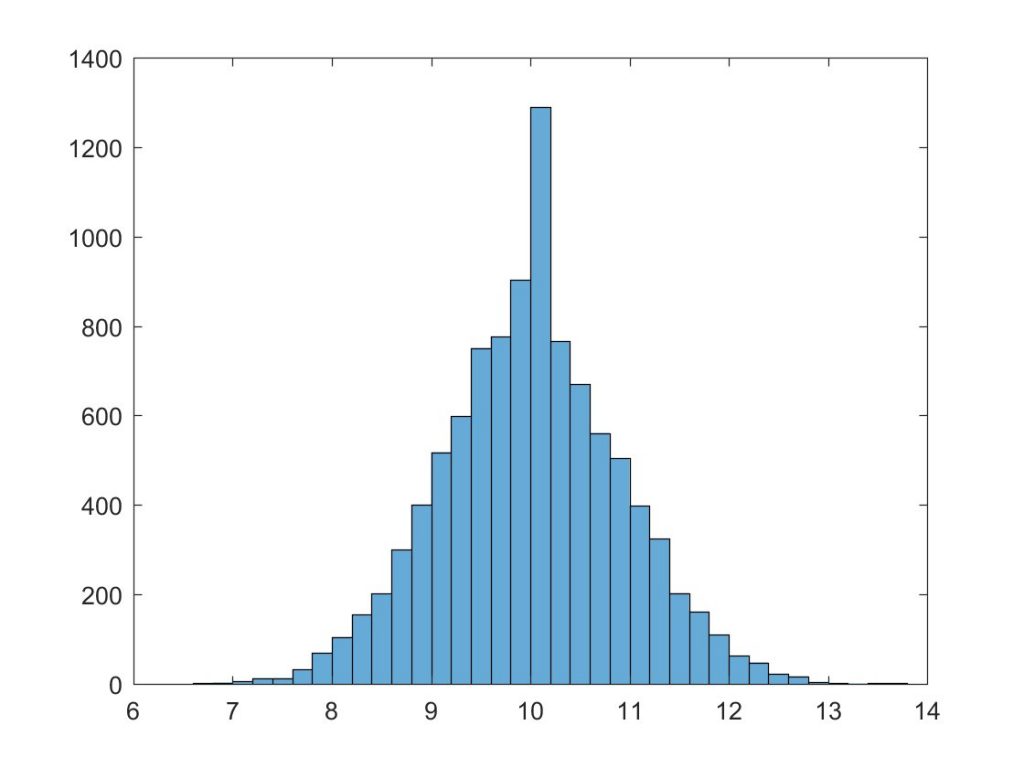
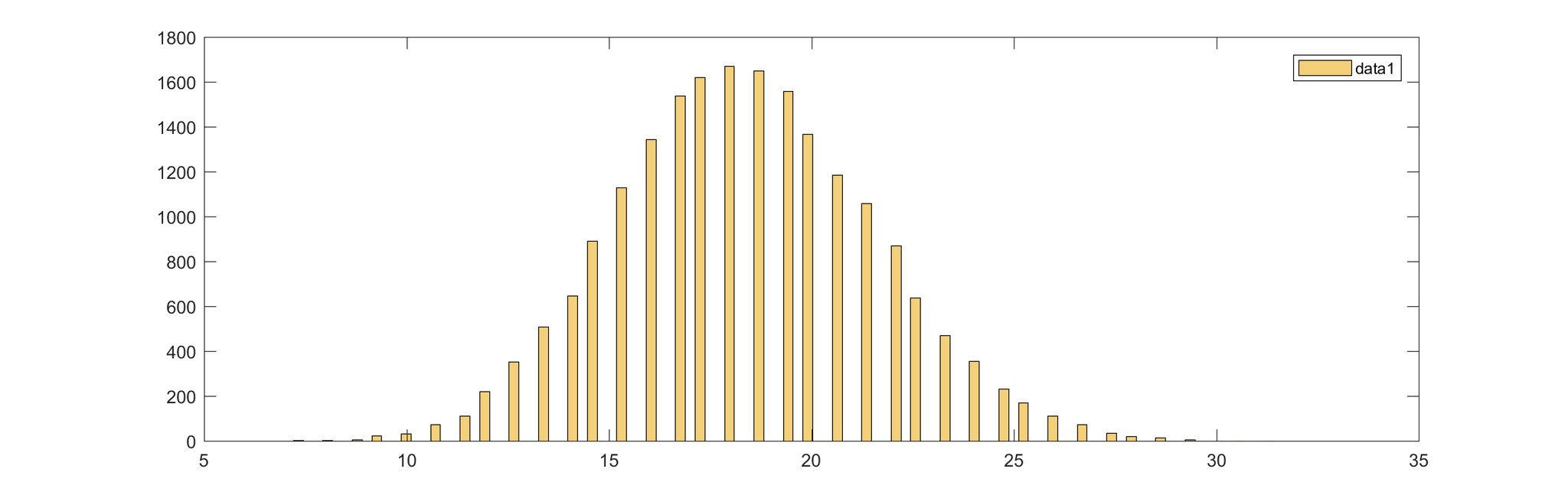
Bryan ran 10,000 simulations and came to the conclusion that either Mainstreet or Léger was wrong. It assumed that “real” voter intentions for QS were at the 10% mark. He simulated for a sample size of 1,010 respondents, as was the case in Léger.
On the horizontal axis are voting intentions for Québec Solidaire (centred at 10% because that’s his starting assumption). On the vertical axis is the number of simulations for which QS got a given score.
Distribution of 10,000 simulations
with QS at 10% and a sample size of 1,010
Source: Breguet, Bryan.“@Alex_Blanchet Voici la distribution de 10000 simulations avec QS à 10% et taille d’échantillon de 1010. Est-ce possible d’etre sous les 8? oui mais peu probable. Et être au-dessus de 13 (avec taille ech de 2650) est quasi impossible”. Tweet. @2closetocall, 30 August 2018.
Léger has QS at 6%, but we see very few simulations peg the left-wing party under 7%. For Mainstreet, Bryan uses data from the nightly polls (available through a paid subscription). Québec Solidaire had at the time 13,1% (it has since smashed the 15% barrier). Once again, nearly to simulations at all came up with such a high result.
An effect limited to QS voting intentions
When we turn to the other parties, we see that there is no systematic bias according to the data collection mode.
Using IVR, Forum places CAQ and the PQ way ahead of other pollsters, beyond the margin of errors.
In the case of Liberals, CROP is the pollster that pegs them uncharacteristically high.
We’ll therefore be keeping a close eye on how the differences in scores between pollsters evolve. They only seem to matter when trying to determine the composition of the National Assembly because it seems that we already know which party will take over the government if the election was held today: Too Close To Call’s Sunday post discusses CAQ’s over 99% chances of winning.
Source data
You can access the spreadsheet from which the charts were generated on Google Spreadsheets.
It seems that Bryan Breguet answered a tad too quickly to Marc-Antoine Berthiaume’s Tuesday tweet pointing out the enormous difference between Léger and Mainstream polls regarding Quebec Solidaire support amongst voters aged 18 to 34. (To find out what the heck I’m talking about or to refresh your memory, read my Wednesday post, “Younger voters and polling variability.”)
Mainstreet big wigs have launched a campaign on Twitter to assert just how confident they are about their polling results (and claiming in passing that Léger’s are out of whack). Here is one of their most recent tweets:
Nous assistons à une croissance réelle de QS au cours des derniers jours. Nous le ressentons de manière anecdotique, et nous le voyons dans nos sondages nocturnes. Quelque chose est en train de se passer.1
(I suppose that by “sondages nocturnes,” the Mainstreet vice-president means “nightly polls.”)
Observing the debate on Twitter, Suzanne Lachance, a former spokesperson for the Rassemblement pour l’alternative progressiste (RAP)—one of Quebec Solidaire’s grandparents,— summed up the situation:
Bon, en plus des querelles de politiciens, nous avons droit aux querelles de sondeurs… 😉2
Bryan’s simulations
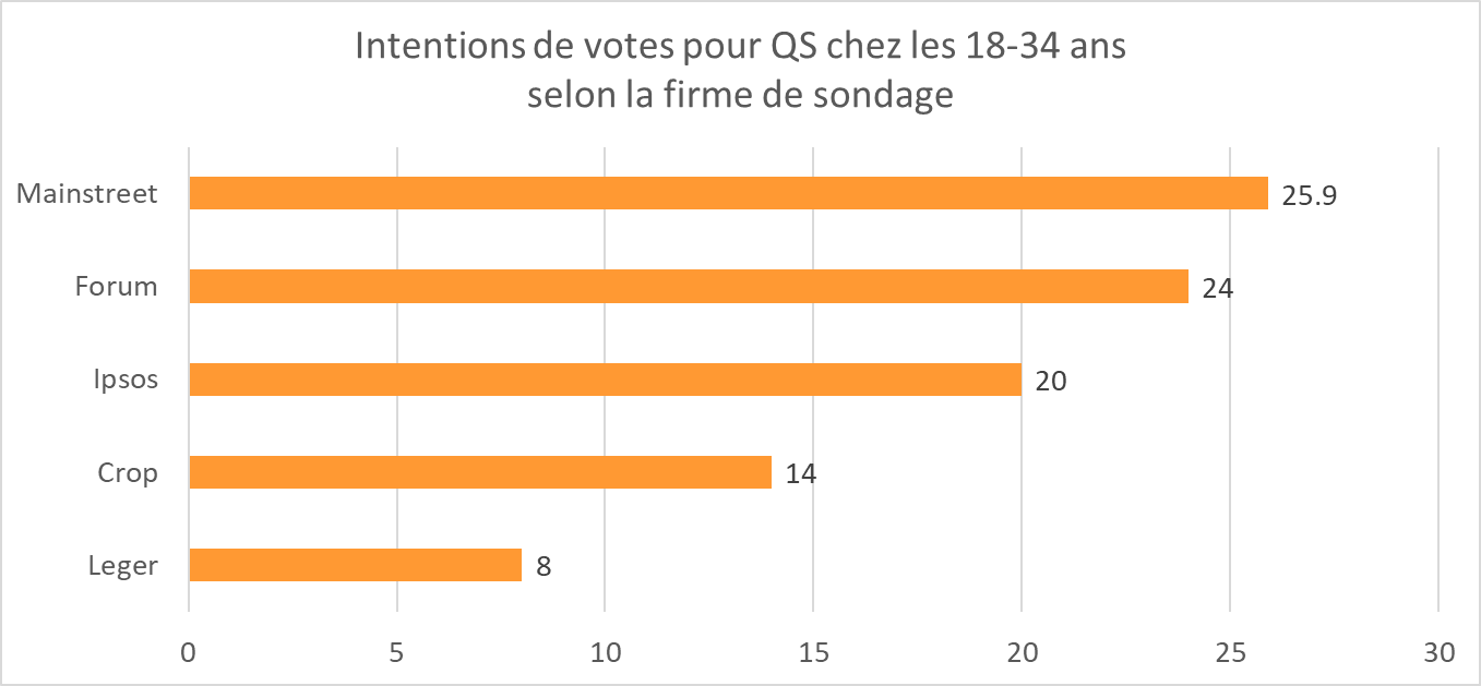
To settle the matter, Bryan made 20,000 simulations, starting from the assumption that “actual” support for QS in that age group is in fact the average of the two polls’ scores: 18.4%. He posited a sub-sample size of 150 respondents (the size of Léger’s sub-sample).
He found that it was highly improbable, though not completely impossible, that, if QS is actually at 18.4% amongst voters aged 18 to 34, one poll would get 8% and another would get 25.9%. The bar chart below shows the number of polling simulations (vertical axis) for which a given score (horizontal axis) was reached for QS support with young people aged 18 to 34.
Source: Breguet, Bryan. “Mais possiblement en raison des faibles tailles d’échantillons (150 chez Léger, 525 chez Mainstreet, les autres entre les deux). J’ai fait 20,000 simulations avec #QS en centrant à la moyenne des sondages (18.4%). Taille d’échantillon théorique pour les simulations: 150.” Tweet. @2closetocall, 30 August 2018.
He came to the conclusion that one of the two polls is probably out of whack (but there’s no way of knowing which one because there would need to be an election right now, not in a month’s time).
Actually, support for QS amongst voters aged 18 to 34 must be either higher, either lower than 18.4%. If it was higher, the curve would be shifted to the right, and the Mainstreet score (25.9%) would no longer be as improbable. In contrast, if it was lower, the curve would be shifted to the left, and the Léger score (8%) would no longer be impossible.
Léger and Mainstreet are the extremes, but neither one nor the other is completely isolated, as can be seen in this bar chart of QS voting intentions for 18- to 34-year-olds:
Source: Breguet, Bryan. “Ok, dernier regard sur les 18-34 ans pour @QuebecSolidaire et les différences entre sondeurs. Tout d’abord, voici le score de QS aprmi les 18-34 ans (électeurs décidés et enclin) chez les 5 firmes.” Tweet. @2closetocall, 30 August 2018.
Here’s how Bryan sums up the situation:
En conclusion: les différences observées entre sondeurs pour QS chez les 18-34 ans ne peuvent pas être complètement expliquées par les marges d’erreur et tailles d’échantillons. Il y a quelque chose d’autre. Après, j’avoue ne pas avoir d’explication actuellement.3
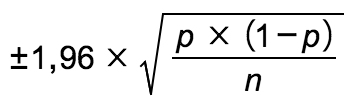
So what’s this margin of error he’s talking about? Is it always ±3, 19 times out of 20?
What factors into the margin of error
Ok, so I’m going to include a formula for those for whom it makes life easier, but don’t worry, I’ll jump directly to the implications.
The margin of error at the 95% level (hence 19 times out of 20) is 1.96 standard deviations or:
where p is the proportion (the percentage for that answer in the poll: 8% in Léger and 25.9% in Mainstreet) and n is the sample size (the number of respondents).
That means that:
The margin of error is not dependent on the size of the population you want to study. Whether you want to find out the opinion in a single riding or in the entire province of Quebec does not affect the margin of error of a given poll.
In other words, it’s not because you’re studying a smaller population that you can settle for a smaller sample: the margin of error depends on the sample size, not the size of the population.
The margin of error goes up when the sample size goes down (that’s much more intuitive).
The margin of error also depends on the poll result (the proportion): the lower the percentage (or, more accurately, the further away from 50%), the smaller the margin of error. It’s therefore not always ± 3 (or the margin of error given at the beginning of the poll), 19 times out of 20.
The confidence interval spreads from the value of the percentage minus the margin of error to the value of the percentage plus the margin of error.
Visualizing the margin of error
Qc125 charts presenting polling results do not show the margin of error and give the impression that it’s showing a variation across time (with the line joining the observations). I don’t like these data visualization decisions.
At least, the visualization contains all the information needed to calculate the margins of error for each observation: the percentage (p) is written in the circles and the sample size (n) is at the bottom of each “column” (on top of the data collection mode and field dates, which don’t influence the margin of error4).
In my next post, I’ll offer you a slightly different way of visualizing poll results and dig deeper into the differences between polling firms.
On top is a bar chart picked up from a Le Devoir article published last night at 9:12pm1 and altered by Jean-François Provençal from the hit millennial-humour TV show Les Appendices. Below is what is called a meme. It’s a still from the TV-reality show The Osbournes in which fallen metalhead Ozzy Osbourne doesn’t know what’s going on when a phone rings.2
Read til the end
Adding “who answer the phone” after “Voting intentions of 18-34-year-olds” presupposes that polls are still conducted by calling randomly selected numbers from the phone book. As I’ve explained in the Polling section of the Elections primer, pollsters have developed new methodologies to adapt to new communication habits.
And, lo and behold, if you read the Le Devoir article until the end, you’ll find this box outlining the methodology:
Méthodologie
Le nouveau sondage Web de Léger a été réalisé auprès de 1010 Québécois ayant le droit de vote du 24 au 28 août, alors que la campagne était commencée. Par comparaison, un échantillon probabiliste similaire aurait une marge d’erreur d’environ plus ou moins 3%, 19 fois sur 20. (emphasis added) 3
So the “problem” with this poll is not that it uses a methodology now deprecated in our smartphone world.
Disagreeing polls
Source: Berthiaume, Marc-Antoine. Tweet. @maberthiaume2, 28 August 2018.
Marc-Antoine Berthiaume raised a much more pertinent issue on Twitter:
Comment expliquer que chez @leger360, pour les 18-34 ans, #QS arrive en 5ème place avec 8% et que @MainStResearch place en 2ème position avec 23,4%? C’est un écart de 15,4%!4
He thus contrasts the Le Devoir chart based on Léger’s polling data with data from Mainstreet’s Baromètre élections 2018. This tool is funded by Groupe Capitales Médias, a conglomerate of Power-Corporation-subsidiary Gesca’s French-language dailies sold to Martin Cauchon.5 There is a paid subscription service for individuals.6
Too Close To Call’s Bryan Breguet replied:
Facile: tailles d’échantillon petites. Donc variance est grande7
but quickly added:
Cela étant dit la différence est un peu grande ici, je l’avoue8
Let’s take a closer look by placing the two datasets side-by-side:
What jumps out at first is that Mainstreet data is provided without the undecided having been allocated to parties since it contains the share of undecided young voters. Léger always provides sub-sample data after having allocated the undecided.
It’s therefore normal that Léger percentages are higher than those in Mainstreet: the sum total of voting intentions in Léger is 100% while it’s 90%10 in Mainstreet. That’s what explains all the blue in the right-hand column (that shows the difference between both datasets).
Incidentally, we can assume that the presence of 1.6% of young voters who intend to cast their ballots for another party in Mainstreet and their absence in Léger is compensated by the presence in the latter of 3% of young voters who intend to back the NPD Quebec. In other words, it’s likely that a fair share of those who would vote for “another” party in Mainstreet would in fact vote for the NPD Quebec.
But that’s not what shocked the interwebz. By bringing together the two datasets and ordering the parties according to their score in Mainstreet, we immediately see where the polls disagree: on voting intentions for Quebec Solidaire and for the Liberals (still with voters aged 18 to 34).
Alexandre Blanchet, a political science Ph.D., offers a convincing demonstration of the uncertainty inherent to polls in his French-language guide to polling for journalists and other geeks. (Just a heads up: I went on the page twice, and it appears to have brought my Internet connection down for a minute both times.)
la bonne question à se poser n’est souvent pas de savoir quel sondage est meilleur qu’un autre, mais plutôt de savoir de quelle réalité il est le plus probable que ces sondages émanent. Les sondages sont une manifestation de la réalité qui nous intéresse. Ils en sont une manifestation plus ou moins précise, et parfois plusieurs réalités différentes pourront être cohérentes avec les sondages que nous observons. Avec le scénario de l’élection de 2003 où la réalité était claire et nette, nous avons obtenu des sondages qui étaient eux aussi très clairs: le PLQ menait, le PQ était deuxième et l’ADQ était troisième. Avec le scénario de l’élection de 2012, où les intentions de vote étaient beaucoup plus serrées, plusieurs réalités étaient concordantes avec les sondages que nous obtenions.11
Indeed, polls can change even if the underlying reality hasn’t itself changed.
In their June podcast, Qc125’s Philippe J. Fournier and L’Actualité’s Alec Castonguay were talking about Laurier-Dorion, my riding (in which Martin was in charge of phone banking during the 2012 elections). This Montreal riding runs south of the Metropolitan between L’Acadie and Papineau. It brings together two very different neighbourhoods on either side of a train track: Parc-Extension to the west and Villeray to the east.
Parc-Ex is the place to go feast on butter chicken (I usually go for lamb korma though) and watch cricket being played by people much more experienced than in Seducing Dr. Lewis.
In Villeray, you’re asked in coffee shops whether you’d like cow’s milk, almond milk or soy milk, and butchers work directly with local farmers to source their meat. In short, it’s a lot like the Plateau in a lot of people’s minds. (The Plateau is very different from Villeray, but I’ll keep my Montreal-focused parochial feuds for those times when I’m visiting with cousins.)
So, as the guys over at the L’Actualité politics podcast were saying, Laurier-Dorion is a riding that Quebec Solidaire could snatch from the Liberals if enough people in Parc-Ex stay home. Up to that point, I’m fully onboard. Where things get dicey is when they contrasted the possible lack of enthusiasm in Parc-Ex’s non-French-speaking electorate —which is solidly in the QLP column— with the supposedly inevitable enthusiasm of QS voters in Villeray:
Les partisans de Québec solidaire, là, ils ne restent pas à la maison. Quand t’es Québec solidaire, dans’ vie, la seule chose qui te reste, c’est d’aller voter. Ok? Parce que tu sais que tu vas pas gagner. Alors ils vont aller voter.1
That might be the impression QS social media fervour gives, but the Quebec Solidaire electorate is in fact the most volatile amongst parties that hold seats in the National Assembly. And I have the numbers to prove it!
Quebec Solidaire is the only party at the National Assembly for which more than half the people intending to vote for it could change their minds. It’s almost always been like that since Léger started breaking down results for Quebec Solidaire voters back in 2012.
Taking a look in the rearview mirror
In the ten Léger polls for which we have QS data, it only happened three times that Coalition Avenir Québec voters professed to be less sure of which party they’d be casting their votes for than those of QS (31 July 2012, 31 August 2012 and 13 March 2014). Incidentally, the Parti Québécois electorate is generally the steadiest.
So they’re gonna vote?
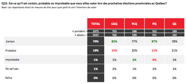
In addition to displaying greater volatility, Quebec Solidaire voters are less inclined to going to the polls than PQ and CAQ voters. It resembles the QLP electorate in that respect.
Four out of five people who said they intended to vote for Quebec Solidaire are “certain” of going to vote, but one out of five did say it was only “probable.” Amongst people intending to vote for the Part Québécois, it’s just one out of ten.
Therefore, the people who tell polling firms that they intend to vote for Quebec Solidaire are not a bunch of democracy warriors perpetually ready for combat. These are ordinary people who are sympathetic either to the party’s discourse or to its approach, but not quite enough in many cases to make it to the polls or to actually change sides.
Source data
You can access the spreadsheet from which the chart was generated on Google Spreadsheets.
So are things that different this time around? I checked in polls from the last ten years. While 45% is indeed a high mark, there have been more voters uncertain of how they will vote before:
First of all, the share of respondents who say that they might change their minds (red bars) is not the most meaningful measure. Indeed, you’d be hard pressed to explain the difference between that answer (in red) and “I don’t know” (in yellow) given that the question being asked is “Have you made a definitive choice?” If 45% seems like a huge proportion, it is still less than when you add up the 24% who said “I don’t know” last May and the 25% who said “I might change my mind”.
The most meaningful measure is the share of voters who say they’ve made up their minds and their choice is definitive. As you can see from the blue bars increasing in height during a given year and then dropping after the election, that proportion always increases as the campaign gets closer and as it progresses.
The other time it happened…
Over the last ten years, in polls conducted by Léger, it previously happened only once that the share of people who had made up their minds dropped below 50%: in January 2012. At that point in time, however, the campaign was still months away. The Liberals had won a majority government in December 2008, so in January 2012, it still had a full year left to its term.
Furthermore, in January 2012, the students had started mobilizing, but their organizing remained under the radar of the mainstream media: the population of Quebec was yet to be polarized by the issue.
So that 45% of voters that could still change their minds is not unheard of, but in the last decade it’s never happened this close to an election.
Source data
You can access the spreadsheet from which the chart was generated on Google Spreadsheets.