It seems that Bryan Breguet answered a tad too quickly to Marc-Antoine Berthiaume’s Tuesday tweet pointing out the enormous difference between Léger and Mainstream polls regarding Quebec Solidaire support amongst voters aged 18 to 34. (To find out what the heck I’m talking about or to refresh your memory, read my Wednesday post, “Younger voters and polling variability.”)
Mainstreet big wigs have launched a campaign on Twitter to assert just how confident they are about their polling results (and claiming in passing that Léger’s are out of whack). Here is one of their most recent tweets:
Nous assistons à une croissance réelle de QS au cours des derniers jours. Nous le ressentons de manière anecdotique, et nous le voyons dans nos sondages nocturnes. Quelque chose est en train de se passer.1
(I suppose that by “sondages nocturnes,” the Mainstreet vice-president means “nightly polls.”)
Observing the debate on Twitter, Suzanne Lachance, a former spokesperson for the Rassemblement pour l’alternative progressiste (RAP)—one of Quebec Solidaire’s grandparents,— summed up the situation:
Bon, en plus des querelles de politiciens, nous avons droit aux querelles de sondeurs… 😉2
Bryan’s simulations
To settle the matter, Bryan made 20,000 simulations, starting from the assumption that “actual” support for QS in that age group is in fact the average of the two polls’ scores: 18.4%. He posited a sub-sample size of 150 respondents (the size of Léger’s sub-sample).
He found that it was highly improbable, though not completely impossible, that, if QS is actually at 18.4% amongst voters aged 18 to 34, one poll would get 8% and another would get 25.9%. The bar chart below shows the number of polling simulations (vertical axis) for which a given score (horizontal axis) was reached for QS support with young people aged 18 to 34.

He came to the conclusion that one of the two polls is probably out of whack (but there’s no way of knowing which one because there would need to be an election right now, not in a month’s time).
Actually, support for QS amongst voters aged 18 to 34 must be either higher, either lower than 18.4%. If it was higher, the curve would be shifted to the right, and the Mainstreet score (25.9%) would no longer be as improbable. In contrast, if it was lower, the curve would be shifted to the left, and the Léger score (8%) would no longer be impossible.
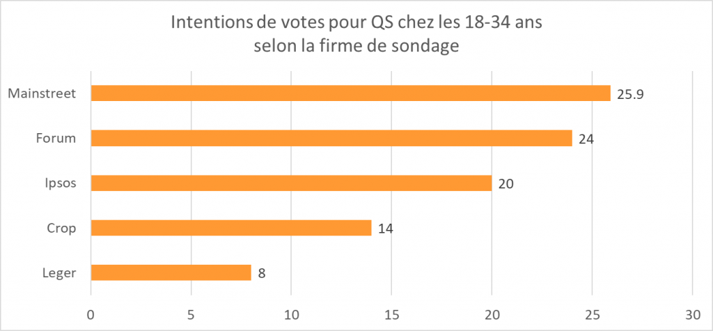
Léger and Mainstreet are the extremes, but neither one nor the other is completely isolated, as can be seen in this bar chart of QS voting intentions for 18- to 34-year-olds:

Here’s how Bryan sums up the situation:
En conclusion: les différences observées entre sondeurs pour QS chez les 18-34 ans ne peuvent pas être complètement expliquées par les marges d’erreur et tailles d’échantillons. Il y a quelque chose d’autre. Après, j’avoue ne pas avoir d’explication actuellement.3
So what’s this margin of error he’s talking about? Is it always ±3, 19 times out of 20?
What factors into the margin of error
Ok, so I’m going to include a formula for those for whom it makes life easier, but don’t worry, I’ll jump directly to the implications.
The margin of error at the 95% level (hence 19 times out of 20) is 1.96 standard deviations or:

where p is the proportion (the percentage for that answer in the poll: 8% in Léger and 25.9% in Mainstreet) and n is the sample size (the number of respondents).
That means that:
- The margin of error is not dependent on the size of the population you want to study. Whether you want to find out the opinion in a single riding or in the entire province of Quebec does not affect the margin of error of a given poll.
In other words, it’s not because you’re studying a smaller population that you can settle for a smaller sample: the margin of error depends on the sample size, not the size of the population.
- The margin of error goes up when the sample size goes down (that’s much more intuitive).
- The margin of error also depends on the poll result (the proportion): the lower the percentage (or, more accurately, the further away from 50%), the smaller the margin of error. It’s therefore not always ± 3 (or the margin of error given at the beginning of the poll), 19 times out of 20.
The confidence interval spreads from the value of the percentage minus the margin of error to the value of the percentage plus the margin of error.
Visualizing the margin of error
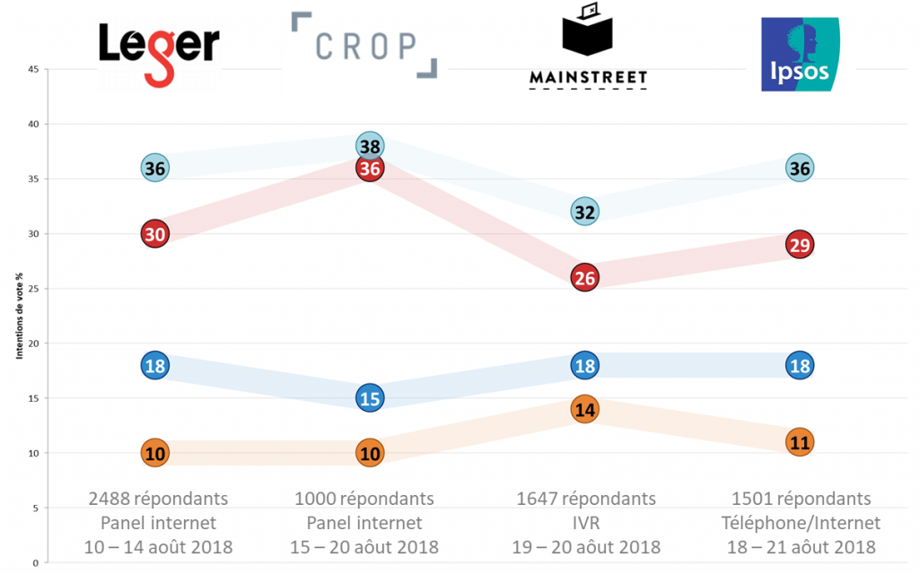
Qc125 charts presenting polling results do not show the margin of error and give the impression that it’s showing a variation across time (with the line joining the observations). I don’t like these data visualization decisions.

At least, the visualization contains all the information needed to calculate the margins of error for each observation: the percentage (p) is written in the circles and the sample size (n) is at the bottom of each “column” (on top of the data collection mode and field dates, which don’t influence the margin of error4).
In my next post, I’ll offer you a slightly different way of visualizing poll results and dig deeper into the differences between polling firms.
Notes
- “We have seen QS support truly increase over the last few days. We feel it anecdotally, and we’re seeing it in our nightly polls. Something is happening.” Pinkus, Steve. Tweet. @StevePinkus1, 30 August 2018.
- “So, in addition to politicians squabbling, we now get pollsters squabbling…” Lachance, Suzanne. Tweet. @LaChanceuse, 30 August 2018.
- “To conclude: differences observed between pollsters for QS amongst voters aged 18 to 34 cannot be fully explained by the margins of error and/or the sample sizes. Something else is going on. That being said, I admit that I currently don’t have an explication.” Breguet, Bryan. Tweet. @2closetocall, 30 August 2018.
- Actually, that’s not true. The data collection mode influences the margin of error insofar as a non-probabilistic sample (in which not everyone has an equal chance of getting selected, say because you need to subscribe, like in a web panel) doesn’t have a margin of error. We approximate one by calculating the margin of error of a probabilistic sample of the same size.