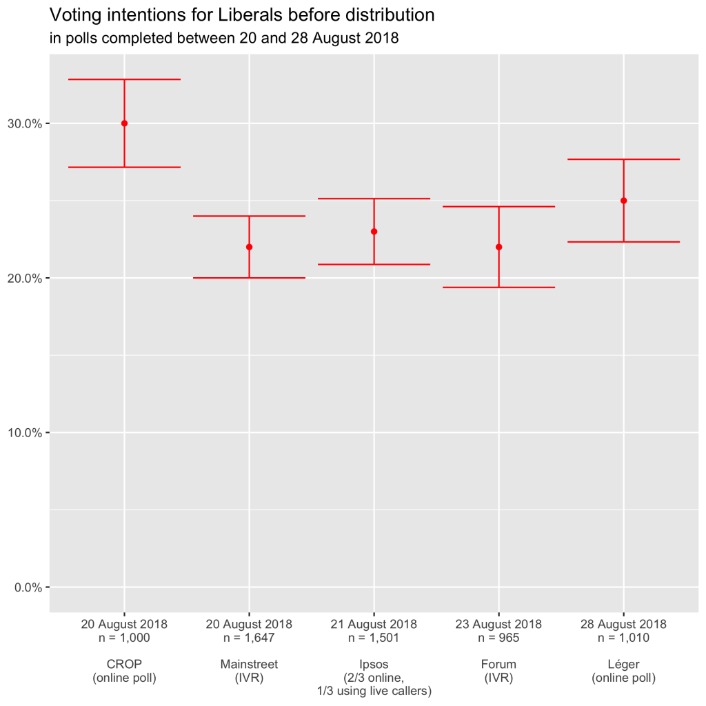
I left you hanging last Friday when I promised a new data visualization of the most recent polls. To refresh your memory, the margin of error depends on the score in the poll (it increases when the score gets closer to 50%) and the sample size (one goes up while the other goes down). It does not depend on the size of the population of which you want to know the opinion.
As promised
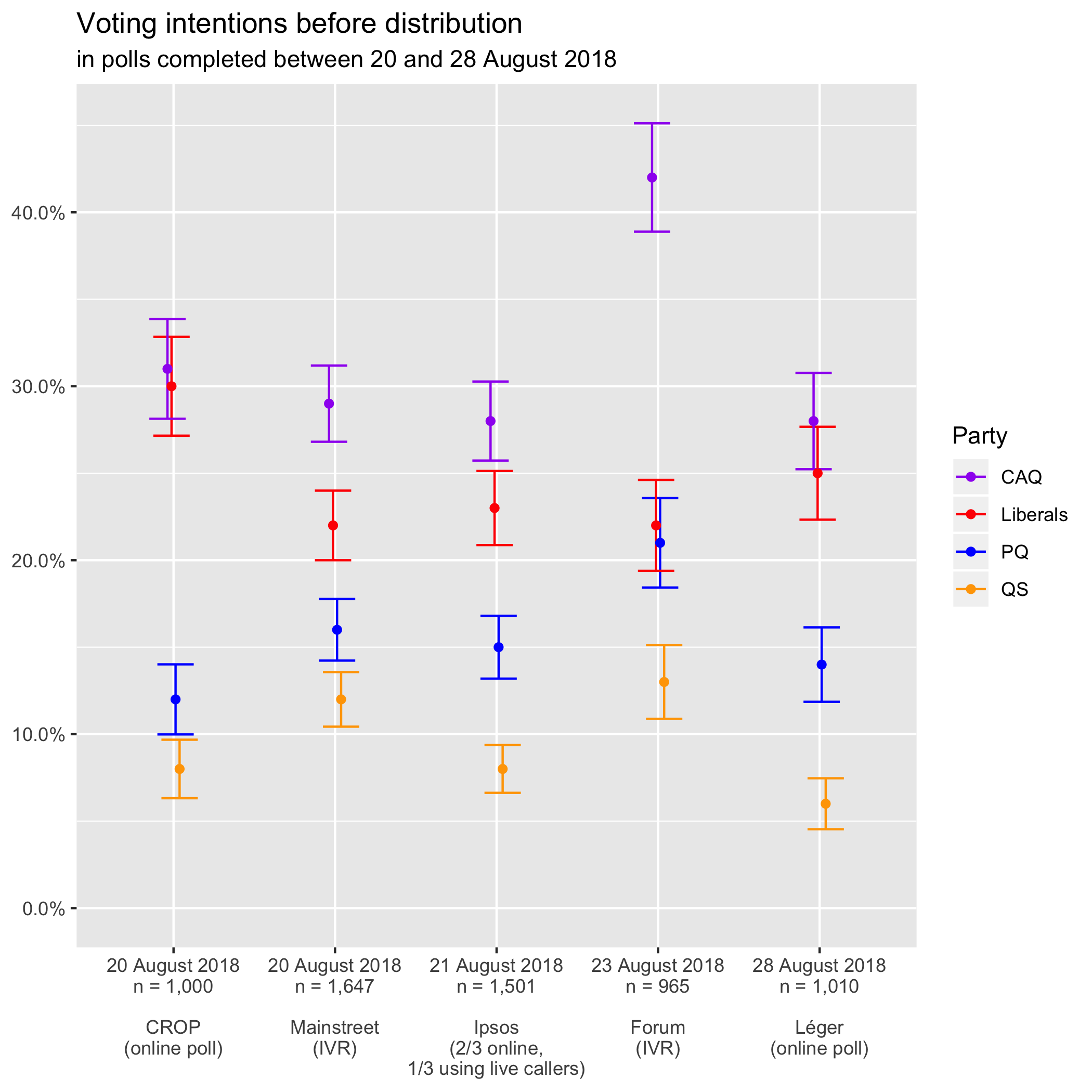
I did a graph similar to the one in Qc125 (with margins of error this time) for the last three polls in that Qc125 diagram. I added the Forum poll (conducted on 23 August with 965 respondents) and the last Léger (conducted from 24 to 28 August with 1010 respondents).1
I first tried to do it in Google Spreadsheets, so you could access the file and check everything out. However, I could only add an error bar that was either a constant or a percentage. As we saw on Friday, polling margins of error are a bit more complicated than that.
I also tried with Excel and its open-source equivalent LibreOffice but bumped into the same problem: there was no way of defining a different error bar for each point. It doesn’t come as much of a surprise, then, that there are so few representations of polling data with margins of error.
I had managed just fine by using candlestick charts (used to describe movements in the stock market), but Martin objected that they were ugly. Hence, to please the pole in our tandem in charge of graphics, I pulled out the big guns and programmed the graph in R, an open-source statistical analysis software.
After too many hours fiddling about, here’s what I got2:
Each point situates the party’s score in the poll. The vertical line contained within the two horizontal lines describes the confidence interval if you take into account the margin of error at 95% (or 19 times out of 20). You can see that the lines higher up are longer than the lower ones. As we said at the beginning, the margin of error increases with the proportion (or rather with its proximity to 50%).
By comparing the scores of different parties vertically within a single poll, we see that:
- in CROP, the CAQ and the Liberals are statistically tied;
- in Forum, the Liberals are statistically tied to the PQ instead (with the CAQ way ahead);
- in Léger, voting intentions for the CAQ and the Liberals overlap and are therefore statistically tied as in CROP.
Differences in data collection mode
Too Close To Call’s Bryan Breguet looked into QS’s diverging polling scores in a blog post last Thursday. He was troubled by the fact that the disagreement follows data collection lines:
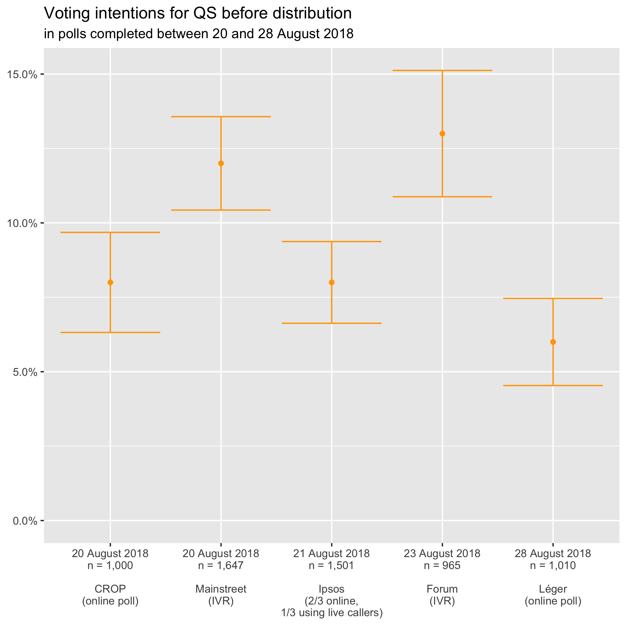
You can see that three polls place the party below 10% and two above (the ones that use IVR or robocalls). More importantly, the results of these two groups don’t overlap, even if we take into account the margin of error. (None of the horizontal bars touches the 10% line.)
Mainstreet and Forum use IVR and get results significantly higher than CROP or Léger using online polls, and Ipsos. The latter combines online polling with good old live callers: humans talking to other humans over the phone to ask them polling questions.
Same old?
Bryan ran 10,000 simulations and came to the conclusion that either Mainstreet or Léger was wrong. It assumed that “real” voter intentions for QS were at the 10% mark. He simulated for a sample size of 1,010 respondents, as was the case in Léger.
On the horizontal axis are voting intentions for Québec Solidaire (centred at 10% because that’s his starting assumption). On the vertical axis is the number of simulations for which QS got a given score.
Distribution of 10,000 simulations
with QS at 10% and a sample size of 1,010
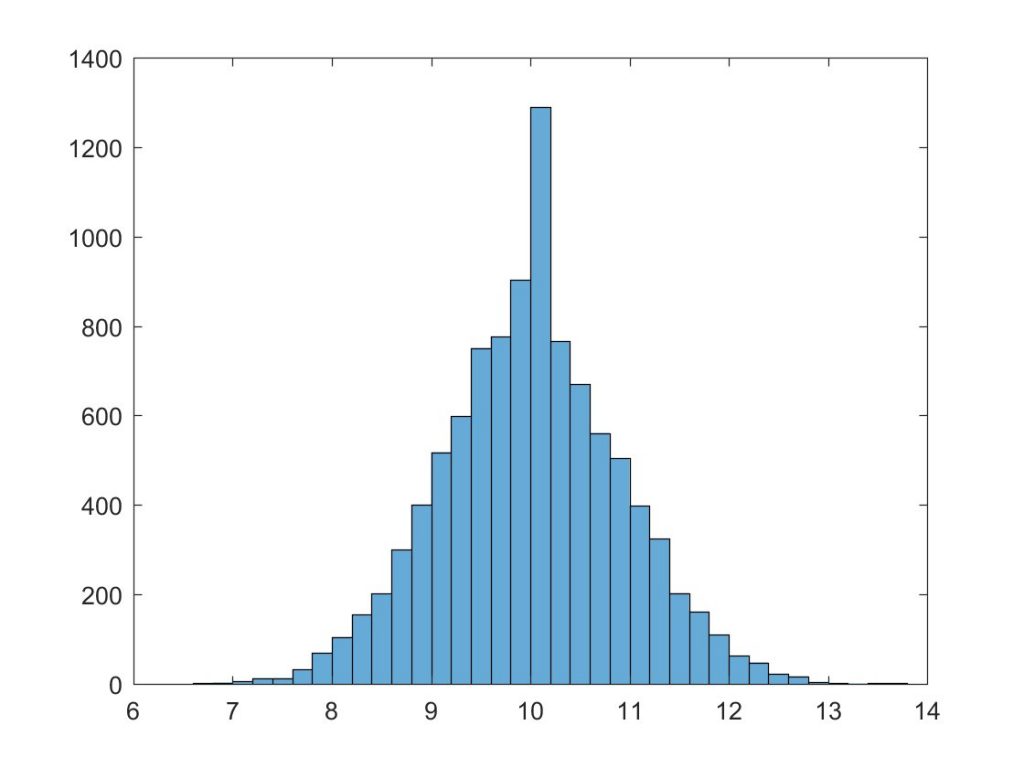
Léger has QS at 6%, but we see very few simulations peg the left-wing party under 7%. For Mainstreet, Bryan uses data from the nightly polls (available through a paid subscription). Québec Solidaire had at the time 13,1% (it has since smashed the 15% barrier). Once again, nearly to simulations at all came up with such a high result.
An effect limited to QS voting intentions
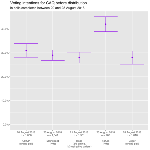
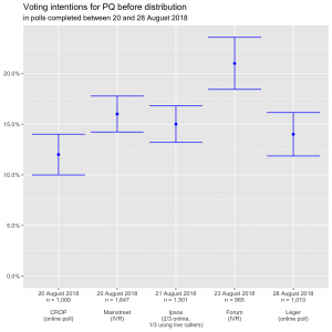
When we turn to the other parties, we see that there is no systematic bias according to the data collection mode.
Using IVR, Forum places CAQ and the PQ way ahead of other pollsters, beyond the margin of errors.
In the case of Liberals, CROP is the pollster that pegs them uncharacteristically high.
We’ll therefore be keeping a close eye on how the differences in scores between pollsters evolve. They only seem to matter when trying to determine the composition of the National Assembly because it seems that we already know which party will take over the government if the election was held today: Too Close To Call’s Sunday post discusses CAQ’s over 99% chances of winning.
Source data
You can access the spreadsheet from which the charts were generated on Google Spreadsheets.
